

One of the most widespread errors in business analytics is thinking that the development of Dashboards in Power BI consists simply of placing flashy graphics on a screen. The reality we find in the market is very different: a dashboard It's not for displaying data, but for facilitating decisions.
It's a common scenario: many organizations have Power BI They have implemented the system and pay for their licenses on a monthly basis, but they face a hidden problem: the reports aren’t being used, they’re overloaded with confusing visuals, and business users aren’t finding any real value in them. In 90% of cases, the problem isn’t technical; it’s one of design and strategic approach.
At Bidatia We don't create reports to fill screens; on the contrary, we design decision-making tools. For this reason, In this article, we analyze the most common real-world use cases and the methodological keys for your Dashboards in Power BI succesfully adopted by your entire organization.
What should a good Power BI dashboard solve?
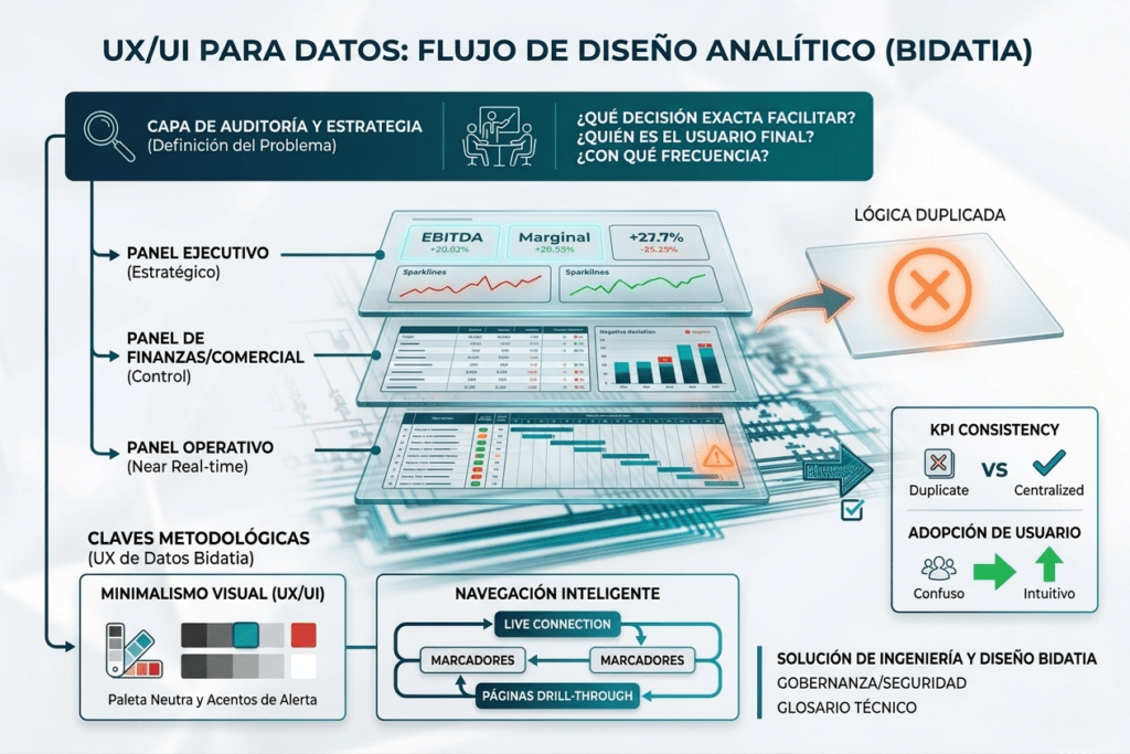
Before dragging a single data field or programming a DAX metric, it is mandatory to answer three fundamental questions:
- What exact decision should this report facilitate?
- Who is going to use it in their day-to-day life?
- How often do you need to consult the information?
Types of Dashboards in Power BI According to Executive Role
There is no «universal dashboard.» For Power BI to work and provide value, dashboards must be designed based on the profile of the user who will consume the information. These are the four key scenarios we implement:
Executive Dashboards (Strategic)
- Audience General Management, CEO, and Administration Committee.
- Objective: Provide a bird's-eye view of the company's health at a glance.
- Key to success: Extreme simplicity. It should contain a maximum of 5 to 7 critical KPIs (EBITDA, net margin, year-over-year growth, customer satisfaction) combined with clear visual alerts. If management needs invoice details, it should be directed to another operational report.
2. Financial Dashboards
- Audience CFOs, Finance Directors, and Management Controllers.
- Objective: Rigorous economic control, deviation analysis, and financial health.
- Key to success: Absolute consistency in metrics and in-depth navigation capabilitiesdrill down) controlled. The user should be able to see the global margin and, with a single click, drill down to the detail of a specific business line or geography.
3. Business and Sales Dashboards
- Audience Sales Managers and Sales Teams.
- Objective: Pipeline tracking, team performance, and conversion rates.
- Key to success: High filtering and multidimensional analysis capabilities. They need to agilely compare sales by channel, individual performance by salesperson, and the status of open opportunities in real time.
4. Operational Dashboards
- Audience Operations, Plant, or Logistics Managers.
- Objective: Optimize daily processes, detect bottlenecks, and mitigate incidents.
- Key to success: Frequent data updatenear real-time) and immediate action orientation. The report must visually alert if an order is delayed or if a machine experiences a technical shutdown.
Design mistakes that kill Power BI adoption
When a Power BI report fails and is forgotten, it's usually due to three wrong design patterns you should avoid:
| Common Error | Business Impact | Recommended Solution |
| «More graphics = better» | Visually saturates the user and causes analysis paralysis. | Limit the canvas to metrics that address a single need. |
| Mix information levels | Breaks the reading flow by mixing strategic KPIs with technical details. | Separate executive views from operational ones using different tabs. |
| Do not prioritize visually | The excess of bright colors makes nothing really stand out. | Implement a clean visual hierarchy with neutral tones and an accent color. |
Methodological keys for creating usable dashboards (Data UX)
To solve these adoption problems, in Bidatia We apply a user experience (UX/UI for Data) oriented design methodology:
- Business Question-Based Design: Each chart should answer a real question. Instead of titling a chart «YTD Sales Evolution», the correct approach is to structure it so that it responds: Are we growing at the expected rate this campaign?
- Visual minimalism: We limit the palette to a maximum of 2 or 3 corporate colors. For example, We use neutral tones (grays) for the background and reserve accent colors (like red or green) solely for highlighting deviations or critical alerts.
- Smart Navigation We leverage native Power BI capabilities like bookmarksbookmarksnavigation buttons and pages drill-through so that the user can navigate the data intuitively, as if they were using a modern web application.
How to know if your Power BI reports are working
An analytical project is successful if it meets these three organizational health indicators:
- Regular use: The report is consulted systematically and is part of the teams' daily or weekly routine.
- More executive meetings: The committees no longer discuss Where does a figure come from or another, but about what actions to take based on a single, governed, and shared data point.
- Reducing Excel Chaos: Drastically reduce the number of manual reports generated in isolated spreadsheets that caused discrepancies in the company's results.
Conclusion: Real Decisions with Power BI Dashboards
The success of an analytical tool doesn't depend on the technical complexity of your formulas; it depends on designing portals oriented towards action, not data accumulation.
At Bidatia We combine the most advanced engineering with analytical business design. We help you audit your current reports and design Dashboards in Power BI that your team really wants to use.